GTEC: Green Technology Education Centre

THE CHALLENGE
The Green Technology Education Centre (GTEC) is a green technology focused education centre that contributes solutions to the social and economic challenges of sustainability in the 21st century. GTEC needs a brand identity that establishes legitimacy as a post-secondary institution.
THE OUTCOME
This brand redesign proposal presents a powerful and renegotiable logo that branches off into sub-brands for both of the institution's Electric Vehicle and Urban Agriculture faculties. The brand guidelines allow for a consistent look and feel for the brand at all stages of GTEC's growth and development.
SCOPE
Brand Identity Rebrand, Logo Redesign

Brand Definition
Choosing an educational institution dedicate money and multiple years of one's life to is a serious commitment. Especially when choosing an instutution without the name recognition, credibility and alumni success stories that come with being an institution that has been open for many years. To make up for this, GTEC needs a world class brand identity that truly understands and speaks to parents and potential students. The first step was to identify GTEC's core values, to do this I first defined key aspects of five categories: culture, customer/student, voice, benefit and value.
1. culture
• Community Oriented
• Friendly
• Inclusive
• Pragmatic
• Forward Thinking
2. Customer
• Young (18-25)
• Ambitious
• Forward Thinking
• Hands-on
• Adventurous
3. Voice
• Confident
• Personable
• Professional
• Excited
• Knowledgable
4. Benefits
• Employed
• Informed
• Confident
• Fulfilled
• Connected
5. Values
• Sustainability
• Pragmatism
• Diversity
• Innovation
• Community
Core values
After identifying traits from each of the five categories, GTEC's core values were established and refined.
1. Sustainability
Leading by example, GTEC aspires to be a world leader in sustainable education. From environmental sustainability by turning students into leaders and innovators, fully pepped to enter the workforce and make a difference. To social sustainability, by providing resources and facilities to the local community.
3. Community
One of GTEC's core missions is to empower local community and generate economic and social prosperity. To achieve this, GTEC offers a variety of scholarship programs and will build student, social and community housing along with retail outlets such as a coffee shop, restaurant and public market.
2. Innovation
GTEC promises to be on the forefront of innovation, not just regarding the topics covered within its curriculum but also the way it approaches education as a whole. By working with industry professionals to consistently keep up with industry trends, students will get hands on experience with technologies and experiences that is unavailable at other institutions.
4. Pragmatism
A common criticism of traditional post-secondary education is that students spend too much time engulfed in academic theory, and enter the workforce ill-prepared and inexperienced. GTEC's industry leading curriculum enables students to learn from working professionals, allowing students to graduate confidently and ready to make a difference in the working world.
Logo development
When developing GTEC's new logo, the goal was to create a word-mark that represented each of the four core values. Gotham Ultra was used as the base font, as its geometric construction, and blue collar origins fits perfectly with the hands-on, practical education that GTEC provides. The typeface was then altered and given 45 degree edges which give each letter a sense of forward moving energy. Finally, a subtle rounding of the edges was added to give the logo a more fluid and friendly feel.

logo variations


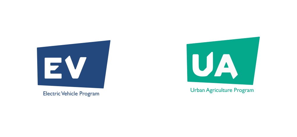
Program Logos
To create logos for each of GTEC's programs, the style treatment used to create the main logo was also applied to other letters. Each program has its own unique color, which combined with the bold letters make for a logo that is easily recognizable and distinguishable from one another while also being a template for the addition of new programs in the future.